In this guide, the reader will explore three distinct methods for concealing the scrollbar in web design using CSS. This journey through CSS techniques begins with an introduction to the overflow property, which is pivotal in managing scrollbars.
Method 1: Employing the CSS Overflow Property
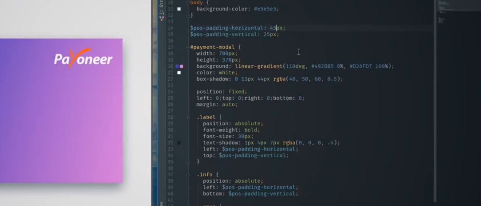
The overflow property in CSS is instrumental for scrollbar manipulation. It encompasses several intrinsic values: auto, hidden, scroll, and visible. For this tutorial’s purpose, the focus will be on ‘overflow: hidden’. This property serves as a shorthand for overflow-x and overflow-y, which control horizontal and vertical scrollbars, respectively. The application of these properties is demonstrated with a practical example involving HTML and CSS code.
Example 1.1: HTML and CSS Integration
In the illustrative example provided, the process begins with the creation of an HTML div container. This container is filled with a substantial paragraph of text, designed to simulate a common scenario in web development where content exceeds the physical boundaries of its container. The div is meticulously styled using CSS, where specific attributes like width, height, border, and padding are defined to give it a distinct appearance and structure.
However, an intriguing challenge emerges as the text overflows the confines of the container. This overflow is a frequent issue in web design, particularly when dealing with dynamic content or varying screen sizes. It poses a problem not just aesthetically, but also in terms of user experience, as important text becomes inaccessible or hidden from view.
To remedy this situation, the CSS ‘overflow: auto’ property is employed. This property is a crucial tool in a web designer’s arsenal, offering a smart solution to handle overflowing content. When applied, it enables the container to adjust dynamically to the content. In this case, it contains the text within the div, and when the content exceeds the container’s height, a vertical scrollbar is automatically introduced. This scrollbar is a functional element, allowing users to navigate through the overflowed content seamlessly. This example serves as a practical demonstration of how CSS can be used to enhance the functionality and aesthetics of a web page. It underscores the importance of considering both design and user interaction in web development. By applying the ‘overflow: auto’ property, designers can ensure that their content is both accessible and presented in a visually appealing manner, regardless of the amount of content or the size of the viewing area.
Method 2: Utilizing ::-webkit-scrollbar for Scrollbar Concealment
The ::-webkit-scrollbar pseudo-element in CSS represents a more advanced, albeit browser-specific, solution in the realm of scrollbar management. This method is particularly intriguing as it provides a delicate balance between visual cleanliness and functional necessity. By applying it to a div.container with the ‘display: none’ property, the scrollbar is artfully concealed, thereby offering a more streamlined look to the webpage. This approach is especially beneficial in designs where minimalism and clean lines are key aesthetic considerations. However, it’s imperative to use this method in conjunction with the ‘overflow: auto’ property. This pairing is essential because while ‘display: none’ hides the scrollbar, ‘overflow: auto’ ensures that the content within the container remains scrollable. This functionality is crucial for user experience, as it allows users to access all content without the visual clutter of a scrollbar.
One significant aspect to consider with the ::-webkit-scrollbar pseudo-element is its browser compatibility. This method is tailor-made for Webkit-based browsers such as Chrome, Safari, and Opera. This specificity means that while it offers a seamless experience on these browsers, the same effect might not be replicated in others like Firefox or Internet Explorer. Therefore, web designers need to be cognizant of their audience and the range of browsers they use. This method exemplifies the innovative ways CSS can be used to enhance user interface design. By hiding the scrollbar, designers can create a more immersive and uncluttered browsing experience. However, the decision to use this method should be informed by an understanding of the target audience’s browser preferences, ensuring that the design remains inclusive and accessible across different platforms.
Method 3: Firefox Exclusive – Using scrollbar-width
The ‘scrollbar-width’ property in CSS emerges as a pivotal tool for those designing with Firefox users in mind, mirroring the functionality of the ::-webkit-scrollbar pseudo-element used in Webkit-based browsers. By setting this property to ‘none’, the scrollbar is effectively hidden within the Firefox browser, maintaining the aesthetic uniformity achieved in Chrome, Safari, and Opera with the ::-webkit-scrollbar method.
This property is a testament to the nuanced intricacies of cross-browser web design. In an environment where different browsers interpret CSS rules in varied ways, ‘scrollbar-width’ offers a Firefox-specific solution, ensuring that designers can achieve consistent visual outcomes across a wider range of browsers. The ability to hide scrollbars while retaining the essential functionality of scrolling content is crucial for modern web design, where the user experience is paramount.
Employing ‘scrollbar-width: none’ is straightforward yet powerful. It allows for the creation of a more streamlined, distraction-free user interface, particularly important for websites where content focus and minimalism are key. However, it’s important for designers to remember that this property is exclusive to Firefox and won’t have any effect in other browsers. This exclusivity underscores the necessity for designers to have a comprehensive understanding of CSS properties and their browser-specific behaviors to ensure a cohesive and functional user experience across all platforms.
Best Practices for Scrollbar Concealment
When opting to hide scrollbars, it’s essential to prioritize user accessibility. Many users depend on scrollbars, so alternate navigation methods like mouse wheels or keyboard shortcuts should be available. Additionally, while ‘overflow: hidden’ can hide scrollbars, it also disables scrolling, which isn’t always desirable. Lastly, ensuring cross-browser compatibility is key for a seamless user experience across various platforms.
This tutorial not only instructs on hiding scrollbars but also emphasizes the importance of understanding the overflow property in CSS for a deeper grasp of web design techniques.
Conclusion: Mastering Scrollbar Visibility in CSS
As we reach the conclusion of this tutorial, it’s clear that mastering the art of controlling scrollbar visibility using CSS is a valuable skill for any web designer. The three methods discussed—utilizing the CSS overflow property, the ::-webkit-scrollbar pseudo-element, and the scrollbar-width property—provide versatile options to address different browser needs and design preferences.
Understanding and implementing these methods empowers designers to create cleaner, more user-focused web interfaces. Concealing scrollbars can enhance the aesthetic appeal of a website, offering a more streamlined and modern look. However, it’s crucial to balance aesthetics with functionality. Removing scrollbars shouldn’t compromise the user’s ability to navigate content easily. Therefore, employing these techniques with a user-centric approach is vital.
Furthermore, the tutorial highlights the importance of accessibility and cross-browser compatibility in web design. Ensuring that content is accessible and navigable, regardless of whether scrollbars are visible or not, is a responsibility that web designers must not overlook. Testing and refining designs across different browsers guarantee a uniform and inclusive user experience. In summary, hiding scrollbars in CSS is more than just a visual preference; it’s a decision that impacts user experience and accessibility. By carefully applying these methods and adhering to best practices, designers can craft websites that are not only visually appealing but also functional and accessible to all users.