
The world of web design heavily relies on how elements are visually presented on the page. When dealing with media such as images or videos, maintaining their original proportions or aspect ratio can be a pivotal factor. After covering aspect ratios, we’ll now delve into CSS Flexbox for managing space in flexible layouts.
This guide provides a comprehensive discussion on handling aspect ratio with CSS.
What is the Aspect Ratio?
The aspect ratio quantifies the width to height proportion of visuals such as images, displays, or design elements. It’s denoted by two figures with a colon in the middle, reflecting the width of the entity in comparison to its height.
Aspect ratio has applications beyond just screens; it’s pertinent to fields like photography, graphic design, and web development. Common aspect ratios include 16:9, the standard for HDTV, and 4:3, which was typical for older TV models, meaning the horizontal span is 16 units for every 9 units of vertical span.
In the realm of CSS for web design, aspect ratio management is achievable through:
- The aspect-ratio property in CSS that sets the width-to-height ratio directly;
- The alternative approach using “padding-top” or “padding-bottom,” known as a workaround, which leverages the element’s padding to affect its height in relation to its width, thereby achieving the desired aspect ratio.
The CSS aspect-ratio Attribute
CSS includes an aspect-ratio attribute which is a native method to circumvent the need for the “padding hack”. This attribute functions as you might anticipate—it applies a specified width-to-height ratio directly to an element.
Rather than utilizing the padding-top property for creating aspect ratios, the aspect-ratio attribute can be utilized instead.
Example:

.aspect-ratio-container {
  aspect-ratio: 16 / 9;
}
The aspect-ratio attribute enjoys widespread support across all modern web browsers:
| Browser | Chrome | Edge | Firefox | Safari | Opera | Firefox for Android | Opera Mobile | Safari on iOS | WebView Android |
| Version Compatibility | 88 | 88 | 89 | 74 | 75 | 89 | 63 | 15.0 | 88 |
Understanding the Aspect Ratio Workaround in CSS
In CSS, the “aspect ratio workaround” technique entails setting a percentage value for either the padding-top or padding-bottom properties to emulate a specific aspect ratio within an element.
The percentage for the padding is derived by dividing the height value of the aspect ratio by its width value, and then multiplying the result by 100%.
For example:
- A 16:9 aspect ratio translates to 9 divided by 16, multiplied by 100, equaling 56.25%;
- A 4:3 aspect ratio equates to 3 divided by 4, multiplied by 100, resulting in 75%;
- A 1:1 aspect ratio simplifies to 1 divided by 1, multiplied by 100, which is 100%.
Implementing this method for an HTML div element might look like this:
.aspect-ratio--16-9 {
  overflow: hidden;
  padding-top: 56.25%;
  background-image: linear-gradient(45deg, #7f14c1, #80fbfb);
}
Aspect Ratio Applications

Aspect Ratio Applications for Images in CSS
Altering an image’s width or height to change its aspect ratio often results in distortion, given that images naturally have a set aspect ratio. A workaround involves using the image as a background within a div element, which is then assigned a defined aspect ratio to avoid this issue.
For a 16:9 display, the CSS might appear as follows:
.aspect-ratio--16-9 {
  overflow: hidden;
  padding-top: 56.25%;
  background: url('city-skyline.jpg') no-repeat center;
  background-size: cover;
}
Using this method, the image adapts to fill the container while preserving the aspect ratio, avoiding any skewing or distortion.
It’s vital to note that using images as backgrounds can impact accessibility, as assistive technologies may not interpret them as content. Background images are best used for decorative elements rather than for conveying information or content. To ensure accessibility, it’s recommended to use img tags for content images.
Responsive Video Embeds with Custom Aspect Ratios
For optimal visual engagement on web pages, videos, a vibrant form of media, need to be styled properly. The widely accepted aspect ratio for videos today is 16:9, a format endorsed by major platforms such as YouTube and Vimeo.
To achieve this, CSS allows for the creation of a container tailored to any dimension, ensuring the video scales to fit it entirely. Setting a precise aspect ratio for videos involves using the CSS “padding hack” along with a mix of other CSS attributes.
Here’s an example HTML structure with a div container encapsulating a video element:
<div class="video-container">
  <video class="video" src="runner.mp4" controls />
</div>
The CSS for the .video-container will include a padding-top to define the aspect ratio. The .video class requires position: absolute to properly align within the container. Further, object-fit: cover and height: 100% ensure the video fills the designated space.
.video-container {
  position: relative;
  padding-top: 56.25%;
}

.video {
  position: absolute;
  top: 0;
  left:0;
  width: 100%;
  height: 100%;
  object-fit: cover;
}
This approach ensures that the video maintains its aspect ratio across different screen sizes and devices, providing a consistent viewing experience that is responsive and aesthetically pleasing.
Aspect Ratio Styling for Iframe Embeds
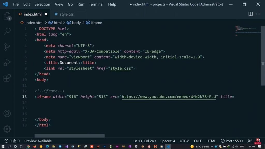
Iframe embeds are commonly used to integrate content such as videos or images from third-party websites, like videos from Vimeo or images from Pinterest. To assign an aspect ratio to an iframe, we can apply the same CSS techniques used for video elements.
Below is an example of how to embed a video from Vimeo using HTML:
<div class="embed-container">
  <iframe class="embed-vimeo" src="https://player.vimeo.com/video/82931517" width="640" height="360" frameborder="0" allow="autoplay; fullscreen; picture-in-picture" allowfullscreen></iframe>
</div>
<p>
  <a href="https://vimeo.com/82931517">Light Goes On</a> from <a href="https://vimeo.com/dariustwin">Darren Pearson</a> on <a href="https://vimeo.com">Vimeo</a>.
</p>
The CSS for video will remain identical.
.embed-container {
  position: relative;
  padding-top: 56.25%;
}

.embed-vimeo {
  position: absolute;
  top: 0;
  left:0;
  width: 100%;
  height: 100%;
  object-fit: cover;
}
This method allows iframes to be responsively sized according to the specified aspect ratio, ensuring a consistent and visually appealing presentation of embedded content on your webpage.
Conclusion
Understanding the intricate dynamics of aspect ratio in CSS is critical for any web designer aiming for responsive and visually rich designs. The techniques discussed—utilizing the aspect-ratio property and the clever ‘padding-hack’—are invaluable tools to this end. While modern browsers have largely adopted the aspect-ratio property, the ‘padding-hack’ remains a reliable fallback for maintaining compatibility with older browser versions. With these techniques in your arsenal, you are well-equipped to create engaging, proportionally balanced media displays for any web project.