
Margin and Padding serve as fundamental CSS properties governing the spacing around HTML elements. Gaining insight into their unique characteristics, behavior, and applications is pivotal for creating well-organized and visually appealing web designs. Delving into the core principles of margin and padding within CSS is crucial for proficiently styling web elements, an expertise that proves invaluable when incorporating elements such as CSS tooltip arrows. This comprehensive guide is dedicated to elucidating the essence of these properties, offering both explanation and visual representation.
The Key Differences: Margin vs Padding
Upon initial inspection, Margin and Padding may appear to serve a common purpose of establishing space around an HTML element. Nevertheless, a fundamental distinction exists in their usage. Padding can be conceptualized as the interior cushion that maintains a separation between the content and the border within the element. Conversely, Margin functions as an external buffer, creating a divide between the element and its neighboring entities.
The CSS Box Model: Foundations of Layout Spacing
Grasping the distinction between margin and padding necessitates an understanding of the box model in CSS.
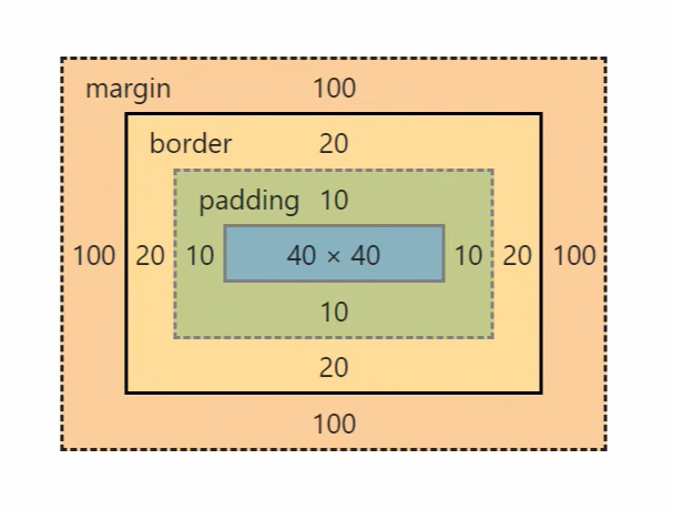
Envision each HTML element as a structured box within the browser, comprising:
- The content area where the actual content resides;
- Padding, which creates space within the element;
- Border, defining the element’s outer edge;
- Margin, which provides clearance outside the element.
Each element is framed by these edges, influencing its overall dimensions:
- The content area is encased by the padding edge;
- The padding is enveloped by the border edge;
- The border is surrounded by the margin edge.
Padding and margin represent essential elements within the structure of an element, playing a substantial role in shaping its visual appearance. Proficiency in discerning the distinct attributes and functions of these components is paramount for achieving effective design outcomes. This comprehension empowers designers with the precision to manipulate element spacing and alignment within the context of a webpage layout.
In the forthcoming sections, we will explore the specific attributes of margin and padding in detail, shedding light on their unique roles and offering insights into their strategic utilization for creating optimal layout designs.
Margins in Web Design
In web design, the concept of margins plays a crucial role in creating visual separation between elements. Defined by the margin edge, the margin area extends beyond the border, providing an empty space that effectively isolates the element from its neighboring elements.
As described by MDN, the margin serves as a transparent space surrounding an element, acting as a buffer zone that pushes the element away from others. This separation is fundamental for maintaining a clean and organized layout, contributing to the overall aesthetics and readability of the webpage. Understanding and effectively utilizing margins is essential for web designers to achieve a visually pleasing and well-structured design.
Margin Characteristics
The attributes outlined below are exclusive to the margin.
Can be auto
It’s possible to use “auto” for the margin value, allowing the browser to automatically determine the margin value. When “auto” is applied, the margin values will be distributed evenly, facilitating the centering of an element.
Here’s an example in CSS:
p {
  width: 50%;
  margin: auto; /* this will center paragraph horizontally */
}
Margin Collapse in CSS
Margin collapse occurs in certain scenarios where margins between elements combine into a single margin, taking the larger value if they are not equal. This behavior typically happens when two elements are placed next to each other or stacked vertically. However, there are exceptions, such as when both margins are applied, as in the case of floats or absolutely positioned elements.
In the example below, the space between the <h1> and <p> elements will be 30px because the margins collapse, and the larger margin value is applied:
<h1>Hello World!</h1>
<p>How are you?</p>
h1 {
  margin-bottom: 30px;
}

p {
  margin-top: 10px;
}
Negative Margins for Element Positioning
Negative margins can be employed to adjust element positioning, similar to how positioning properties work. When a negative margin value is applied, it shifts the element in the opposite direction.
In the following example, the paragraph will be shifted to the left by 60px:
p {
  margin: 0 0 0 -60px;
}
Margins and Element Size
Margins differ from padding in that they do not have the ability to modify the size of an element. In the context of the box model, margins serve the purpose of creating separation between an element and its adjacent content. Consequently, regardless of the margin value you specify, the size of the element itself will remain unaffected.
Effective Uses of Margins in CSS
Margins are typically employed in CSS to establish spacing between elements, create gaps, or control the positioning of elements. Their versatility stems from their ability to be set to “auto” or negative values.
Important Note: It’s crucial to remember that the margin area is non-clickable. This is because it represents the empty space surrounding an element.
Padding in Web Development
In the realm of web development, the padding area plays a crucial role in expanding the content area of an element. This space, delineated by the padding edge, extends the boundaries of the content to incorporate the element’s padding.
As an integral concept, padding refers to the gap between the genuine content and the border of the element. This area not only influences the visual spacing but also accommodates any background-color or background-image properties that have been assigned to the element. Exploring the nuances of padding is essential for web developers to optimize layout and design, ensuring a seamless and visually appealing user experience.
Padding Characteristics in CSS
There are several distinctive features associated with padding in CSS that set it apart from other properties:
Cannot be Auto or Negative
Unlike margins, padding cannot have auto or negative values. Applying auto or negative values to padding will not visibly affect the element’s appearance. However, it may be flagged as an invalid property value in the Element Inspector.
Not Collapsible
Padding represents the space inside an element, and as such, it cannot collapse. It maintains its designated size without any alterations.
Can Alter Element Size
Padding directly impacts the size of an element. This effect is especially noticeable when background color or border properties are applied. Nevertheless, when attempting to retrieve element size with JavaScript, it is contingent on the CSS box-sizing property and the method employed.
Effective Use of Padding in Design
Padding serves several valuable purposes in web design:
- Enhancing Visual Appeal: Padding can be used to enhance the visual appeal of elements. It provides spacing between an element’s content and its borders, giving it a polished appearance;
- Improved User Experience and Accessibility: Increasing padding can also expand an element’s size, which is beneficial for both user experience (UX) and accessibility. For example, on mobile devices, buttons or input fields with ample padding are easier to tap, improving usability;
- Maintaining Aspect Ratios: The “padding hack” is a technique that leverages padding to maintain an element’s proportions across various viewports. This approach is especially useful for ensuring consistent aspect ratios in responsive designs.
Margin and Padding shorthand syntax
Within the realm of CSS, both the margin and padding properties present efficient shorthand syntax. These abbreviated alternatives offer versatility and simplicity, granting you the ability to set these properties in four discernible manners.
Single value – applies to all margins: top, right, bottom, and left.
p {
  margin: 10px;
}
Two values – the initial one adjusts vertical margins (top and bottom), while the second controls horizontal margins (right and left).
p {
  margin: 10px 20px;
}
Three values – the first and third values establish top and bottom margins respectively, while the second value defines the margins for both the right and left sides.
p {
  margin: 10px 20px 15px;
}
Four values – each margin side is individually configured in the specified sequence: top, right, bottom, and left.
p {
  margin: 10px 20px 15px 0;
}
Conclusion
The correct understanding and implementation of Margin and Padding in CSS is paramount for effective web design. By distinguishing their properties and knowing their appropriate usage, web designers can ensure more intuitive, responsive, and aesthetically pleasing layouts.