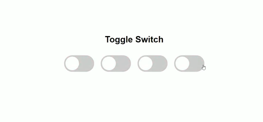
A toggle switch button is a key component in the design of modern User Interfaces. Its usage has expanded significantly, moving from being a common element on smartphones to a widespread feature on web interfaces.
Such a button is an excellent way to visually communicate to users whether a specific function or setting is enabled or disabled. A classic example of its utility is the toggle switch used to activate dark mode on websites and applications.
This article aims to teach the creation of a toggle switch button using purely HTML and CSS. The design and implementation strategy is focused on achieving a look and feel reminiscent of iOS interfaces. Additionally, this method ensures that the appearance of the toggle switch remains consistent across different web browsers. Another key aspect of this design is its seamless integration within web forms, making it not only aesthetically pleasing but also user-friendly and practical in various web applications.
While mastering the art of designing simple toggle buttons using only CSS enhances interactive elements, the same principles can be extended to understand and effectively apply margins and padding in CSS, crucial for refining and perfecting website layout and design.
HTML Structure for a Toggle Switch
A variety of HTML elements can be utilized to construct a toggle switch. In this instance, the focus will be on using the checkbox element due to its suitability for this purpose.
<input class="switch-toggle" type="checkbox">Opting for a checkbox, as opposed to a button, div, or span, presents several benefits:
- Enhanced Accessibility with Label Association: Pairing it with a label element improves accessibility;
- CSS Styling Flexibility: The state of the checkbox can be managed using CSS selectors, allowing for more dynamic styling;
- Form Integration Ease: Retrieving the value of the toggle switch when incorporated into forms is straightforward.
To optimize the toggle switch’s functionality and accessibility, additional HTML structuring is necessary.
The checkbox should be encapsulated within a label tag, which will act as the interactive area for the switch. Additionally, a span element will visually represent the track and thumb of the switch.
<label class="switch-toggle-container">
  <input class="switch-toggle-input" type="checkbox">
  <span class="switch-toggle"></span>
</label>
This arrangement not only enhances the switch’s usability but also ensures it is more accessible and seamlessly integrates with various web designs.
Styling Steps
To begin, the checkbox will be made invisible while remaining functional. This is achieved by setting its opacity to zero and positioning it out of the normal document flow. This technique allows the checkbox to maintain its focusable state for navigation purposes.
.switch-toggle-input {
  opacity: 0;
  position: absolute;
  z-index: -1;
}
Next, the label tag, which serves as the container for the toggle switch, requires specific positioning and display settings. This ensures the toggle switch is correctly positioned within the user interface.
.switch-toggle-container {
  position: relative;
  display: inline-block;
}- The final step is to style the span element, which will visually represent the track of the toggle switch;
- The ::after pseudo-element of this span will be styled to represent the thumb of the switch, providing the distinctive look of a toggle switch.
Tip: These styling principles can also be applied to create a toggle switch from a button or any other HTML tag, offering versatility in implementation.
.switch-toggle {
  position: relative;
  display: inline-block;
  margin: 0 0 10px;
  width: 50px;
  height: 30px;
  background: #ddd;
  border-radius: 50px;
  transition: background .2s ease-in-out;
  cursor: pointer;
}

.switch-toggle::after {
  content: '';
  position: absolute;
  top: 2px;
  left: 2px;
  width: 26px;
  height: 26px;
  background: #fff;
  border-radius: 50px;
  box-shadow: 0 0 3px 1px rgba(0,0,0,0.15);
  transition: left .2s ease-in-out,
              width .2s ease-in-out,
              transform .2s ease-in-out;
}
To initiate the movement of the thumb upon clicking, leverage the :checked pseudo-class on the checkbox input, coupled with an adjacent sibling combinator (+) to select the associated span.
.switch-toggle-input:checked + .switch-toggle {
  background: #30e16b;
}

.switch-toggle-input:checked + .switch-toggle::after {
  left: calc(100% - 2px);
	transform: translateX(-100%);
}
To designate dimmed gray colors and a suitable cursor for the disabled toggle, let’s apply the necessary styling.
.switch-toggle-input:disabled {
  pointer-events: none;
}

.switch-toggle-input:disabled + .switch-toggle {
  cursor: not-allowed;
  background: #eaeaea;
}

.switch-toggle-input:disabled + .switch-toggle::after {
  background: #f8f8f8;
}
To enhance accessibility, consider incorporating an outline during the focus state.
.switch-toggle-input:focus + .switch-toggle::before,
.switch-toggle-container:active .switch-toggle-input:not([disabled]) + .switch-toggle::before {
  outline: 2px solid #5195fe;
  outline-offset: 2px;
}- Ultimately, to achieve an iOS-like feel, introduce a subtle transition effect for the thumb as it moves;
- Upon clicking, the thumb will expand while shifting to the opposite side and subsequently return to its original size.
.switch-toggle-container:active .switch-toggle-input:not([disabled]) + .switch-toggle::after {
  width: 34px;
}
Incorporating Text into the Toggle Switch
Enhancing your toggle switch control with text can offer users a clearer understanding of its current state, indicating whether it’s switched on or off.
This feature can be implemented by utilizing the content property within the pseudo-element of the switch. The text is dynamically displayed to reflect the toggle switch’s status.
.switch-toggle::after  {
  content: 'Off';
  display: inline-flex;
  justify-content: center;
  align-items: center;
  font-size: 11px;
  color: #444;
}

.switch-toggle-input:checked + .switch-toggle::after {
  content: 'On';
}
With these styles, the toggle switch not only performs its function but also communicates its state more explicitly through the embedded text, enhancing user interaction and understanding. This approach is particularly useful in interfaces where visual cues are paramount for user experience.
Conclusion
Incorporating a switch button using pure CSS in your web design can significantly enhance the user experience. Following the steps outlined in this guide will not only offer a visually pleasing design but also ensure uniformity across various browsers. Remember, a well-designed UI can make a big difference in the website’s overall performance and user interaction. The toggle switch button is just a small piece of the puzzle, but it plays a key role in enriching the overall user experience.