Hover text, often referred to as tooltips, presents a valuable enhancement for your website or web application. These tooltips furnish extra insights or explanations when users glide their cursor over particular elements. Within this article, we shall delve into three distinct techniques for crafting hover text utilizing HTML and CSS.
Method 1: Utilizing the Title Attribute for Creating Informative Hover Text
Creating hover text on your web page is a breeze, and one of the simplest ways to achieve this is by employing the “title” attribute in your HTML code. This method is not only straightforward but also eliminates the need for any additional CSS styling, making it a quick and effective way to enhance user experience on your website.
HTML Code Example:
<!DOCTYPE html>
<html>
<head>
    <title>Hover Text Example</title>
</head>
<body>
    <a href="#" title="This is a hover text example">Hover Me</a>
</body>
</html>
In-Depth Explanation:
In the code snippet above, we’ve provided a detailed example of how to use the “title” attribute to create hover text. Here’s what’s happening:
- HTML Structure: We begin with a standard HTML structure, including the necessary tags for creating a web page;
- Anchor Element: Inside the body of the document, we have an anchor element <a> with the text “Hover Me.” This is the element that users will interact with to trigger the hover text;
- Title Attribute: Within the anchor element, we’ve added the “title” attribute and assigned it the value “This is a hover text example.” This is the text that will be displayed when a user hovers their mouse pointer over the “Hover Me” link.
Advantages of Using the Title Attribute for Hover Text:
- Simplicity: This method is incredibly simple and requires minimal coding effort;
- No Additional Styling: You don’t need to write any additional CSS styles to create hover text using the “title” attribute, making it a convenient option for quick implementations;
- Built-In Browser Feature: Most web browsers automatically recognize and display the content of the “title” attribute as a tooltip when users hover over the associated element.
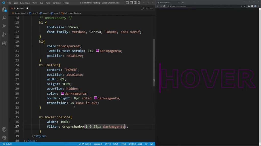
Method 2: Enhance Tooltip Customization with CSS Pseudo-classes
One of the most intriguing ways to create captivating tooltips for your website is by harnessing the power of CSS pseudo-classes. This method grants you unparalleled control over the appearance and behavior of tooltips, allowing you to seamlessly integrate them with your website’s unique design. Here, we’ll delve into this approach, providing comprehensive insights, tips, and a step-by-step example for you to follow.
CSS Pseudo-classes: Unveiling the Magic
CSS pseudo-classes are dynamic selectors that can target specific elements in response to user interactions. By utilizing them, you can craft tooltips that not only enhance user experience but also align with your website’s aesthetics. Let’s explore how to implement this technique effectively.
Step 1: Set the Stage with HTML Structure
Begin by structuring your HTML to accommodate the tooltip element. In our example, we’ve encapsulated the text “Hover Me” within a div element with a class of “tooltip.” Inside this container, we’ve placed a span element with the class “tooltip-text,” which will house our tooltip content.
<!DOCTYPE html>
<html>
<head>
    <style>
        /* Your CSS styles will go here */
    </style>
</head>
<body>
    <div class="tooltip">
        Hover Me
        <span class="tooltip-text">This is a custom hover text example.</span>
    </div>
</body>
</html>
Step 2: Craft the CSS Magic
Now, let’s dive into the CSS code that brings your tooltip to life. Below is a breakdown of the essential CSS properties and pseudo-classes used to create a stylish and interactive tooltip:
- .tooltip: This class styles the container for your tooltip and sets it to position: relative, ensuring the tooltip positions relative to this container;
- .tooltip-text: This class governs the appearance and behavior of the tooltip itself. It starts with visibility: hidden to hide the tooltip by default. Key properties include:
- background-color: Defines the background color of the tooltip, giving it a distinct appearance;
- color: Specifies the text color within the tooltip, ensuring readability;
- padding: Adds space around the tooltip content for a polished look;
- border-radius: Rounds the corners of the tooltip, enhancing its visual appeal;
- position: absolute: Positions the tooltip absolutely within the container;
- z-index: 1: Ensures the tooltip is displayed above other elements;
- bottom: 125%: Determines the distance of the tooltip from the container’s bottom;
- left: 50%: Centers the tooltip horizontally;
- transform: translateX(-50%): Perfectly centers the tooltip;
- opacity: 0: Makes the tooltip initially transparent;
- transition: opacity 0.3s: Adds a smooth fade-in effect when the tooltip becomes visible.
Step 3: Add the Hover Effect
The true magic happens when users hover over the “Hover Me” text. This is achieved by utilizing the .tooltip:hover .tooltip-text selector, which targets the tooltip when the container is hovered. It sets the visibility to visible and increases the opacity to 1, smoothly revealing the tooltip.
Method 3: Elevate Your Website with CSS Frameworks
Do you want to effortlessly enhance your website’s interactivity and aesthetics without delving into the intricacies of custom CSS coding? Look no further – CSS frameworks like Bootstrap and Bulma are your trusty allies. These robust frameworks come equipped with a treasure trove of pre-built components, including the coveted tooltips that can add that extra layer of information and engagement to your web elements. In this section, we’ll explore how to integrate Bootstrap tooltips into your project and provide some insightful tips to make the most of them.
Leveraging Bootstrap for Effortless Tooltips
1. Getting Started
Adding Bootstrap tooltips to your web elements is as straightforward as it gets. Follow these simple steps:
- First, ensure you have an HTML document ready for your website;
- Next, include the Bootstrap CSS library by adding the following line within the <head> section of your HTML document:
<link rel="stylesheet" href="https://maxcdn.bootstrapcdn.com/bootstrap/4.5.2/css/bootstrap.min.css">2. Implementing Tooltips
Now that you have Bootstrap’s CSS library integrated, it’s time to add tooltips to specific elements on your page. Let’s say you want to add a tooltip to a link element. Here’s how you can do it:
<a href="#" data-toggle="tooltip" title="This is a Bootstrap tooltip">Hover Me</a>In this example, the data-toggle=”tooltip” attribute signals Bootstrap to treat this anchor element as a tooltip trigger, and the title attribute specifies the text that will appear when users hover over it.
3. Including JavaScript Libraries
To ensure the tooltips function properly, you’ll need to include the necessary JavaScript libraries. Add the following script tags just before the closing </body> tag of your HTML document:
<script src="https://code.jquery.com/jquery-3.5.1.slim.min.js"></script>

<script src="https://cdn.jsdelivr.net/npm/@popperjs/[email protected]/dist/umd/popper.min.js"></script>

<script src="https://maxcdn.bootstrapcdn.com/bootstrap/4.5.2/js/bootstrap.min.js"></script>
4. Initialize Tooltips
Finally, to activate the tooltips, use JavaScript to initiate them when the document is ready. Insert this script in your document:
<script>
    $(document).ready(function(){
        $('[data-toggle="tooltip"]').tooltip();
    });
</script>
This script ensures that all elements with the data-toggle=”tooltip” attribute become interactive tooltips when the page loads.
Conclusion
In summary, the incorporation of hover text into your website or web application has the potential to elevate the user experience and furnish valuable information. Your selection among these three methods can be tailored to your individual preferences and the demands of your project. Whether your inclination leans towards a straightforward method utilizing the title attribute, or you seek a more personalized tooltip adorned with CSS, you possess the means to seamlessly integrate hover text for maximum effectiveness.