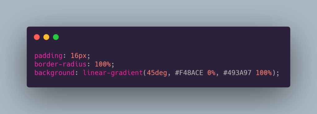
Creating captivating designs often involves intricate details like gradient borders in CSS. While the border-image property is the go-to for gradients, it has limitations. Let’s explore alternative methods for achieving gradient borders with finesse.
How to do gradient borders in CSS

Creating gradient borders in CSS can add a stylish touch to elements on your webpage. You can achieve this effect using the CSS border-image property along with gradients. Here’s an example:
HTML:
html
Copy code
<div class="gradient-border"> <!-- Your content here --> </div>CSS:
css
.gradient-border { /* Set the width and height */ width: 200px; height: 200px; /* Create a linear gradient */ border-image: linear-gradient(to right, #f00, #00f) 1; /* You can adjust the direction and colors of the gradient as desired */ /* Set the border width */ border-width: 5px; /* Ensure the border image slices properly */ border-image-slice: 1; /* Optional: Make the border rounded */ border-radius: 10px; /* Other styles as needed */ }This code creates a div with a gradient border. You can adjust the width, height, border-width, border-radius, and the linear-gradient properties to suit your design needs. The border-image property allows you to use an image, gradient, or pattern as the border.
Remember that browser compatibility might vary, so it’s always a good idea to test in different browsers to ensure the desired effect.
- Using border-image Property
To establish gradient borders in CSS, the border-image property is a starting point. However, it presents restrictions, like the inability to incorporate border-radius.
The border-image property allows you to create complex borders using an image. However, it’s also possible to utilize gradients directly within this property. Here’s an example of creating a gradient border using border-image:
HTML:
html
<div class="gradient-border"> <!-- Your content here --> </div>CSS:
css
.gradient-border { /* Set the width and height */ width: 200px; height: 200px; /* Create a linear gradient */ border-image: linear-gradient(to right, #f00, #00f); /* You can adjust the direction and colors of the gradient as desired */ /* Set the border width */ border-width: 5px; /* Ensure the border image slices properly */ border-image-slice: 1; /* Optional: Make the border rounded */ border-radius: 10px; /* Other styles as needed */ }In this code snippet, border-image directly uses the linear-gradient to create a border with a gradient effect. Adjust the gradient direction (to right, to left, to top, to bottom, etc.) and colors as needed to achieve the desired effect.
The border-width, border-image-slice, border-radius, and other properties help refine the appearance of the border.
Remember to test in various browsers to ensure compatibility as some older browsers might have limited support for these advanced CSS properties.
Result: A gradient border emerges, yet constraints persist.
- Pseudo-element Workaround
Employing pseudo-elements for gradient borders requires strategic layering. By setting a negative margin, background, and border-radius inheritance, a workaround emerges.
If you want to create gradient borders using a workaround with pseudo-elements (::before and ::after), here’s an example:
HTML:
html
<div class="gradient-border"> <!-- Your content here --> </div>CSS:
css
.gradient-border { position: relative; width: 200px; height: 200px; overflow: hidden; } .gradient-border::before, .gradient-border::after { content: ""; position: absolute; top: 0; left: 0; width: calc(100% - 10px); height: calc(100% - 10px); z-index: -1; } .gradient-border::before { border: 5px solid transparent; border-image: linear-gradient(to right, #f00, #00f); border-image-slice: 1; } .gradient-border::after { border: 5px solid transparent; border-image: linear-gradient(to right, #00f, #f00); border-image-slice: 1; transform: rotate(180deg); }Explanation:
- The .gradient-border div acts as a container with position: relative and overflow: hidden to hide overflowing pseudo-elements;
- ::before and ::after are used to create two pseudo-elements to simulate the top and bottom borders;
- The border-image property with a gradient is applied to these pseudo-elements, one for the top border and the other for the bottom;
- border-image-slice ensures the border image is sliced properly.
This workaround simulates gradient borders by overlaying two pseudo-elements on the top and bottom sides of the container. Adjust the width, height, border sizes, and gradients to suit your design preferences.
As always, testing across different browsers is recommended to ensure consistent behavior and appearance.
Result: A gradient border via pseudo-elements with inherited properties.
- Masking Technique
Utilizing the mask property, another avenue to achieve gradient borders unfolds. By masking specific areas, we control gradient visibility within the border.
Result: Manipulating gradients via masking for refined borders.
- Background Clip Approach
For a seamless gradient border sans pseudo-elements, background-clip property aids in precision. Clipping backgrounds strategically shapes gradients.
Result: Achieving gradient borders without extra pseudo-elements.
- Demo & Further Exploration
Visit CodePen for detailed examples showcasing these CSS techniques to master gradient borders.
Conclusion
From border-image to masking and background clipping, diverse techniques unlock gradient border creativity. Each method offers distinct advantages, catering to varied design needs. Embrace these CSS tricks to add depth and allure to your web designs.


