Circle progress bars have emerged as a favored choice in web design for their visually engaging and space-efficient qualities. These bars represent a significant departure from the traditional horizontal progress bars, offering a fresh perspective on data visualization. The key advantage of circle progress bars lies in their ability to be arranged in rows, a feature that dramatically enhances the capability to present more data in a limited space. This spatial efficiency makes them particularly suitable for dashboards, analytics interfaces, and any application where space is at a premium and data display is critical. The aesthetics of circle progress bars also contribute to their growing popularity. Their round shape offers a clean, modern look that can easily blend with various design themes. This versatility enables web designers to integrate them seamlessly into diverse web environments, from professional business sites to creative portfolios. The circular shape also resonates with users, often perceived as more dynamic and engaging compared to linear progress bars.
In terms of functionality, circle progress bars are not just about visual appeal; they offer a clear and concise way to convey progress or data. When users glance at these bars, they can instantly grasp the amount of progress made or the data being represented, thanks to the intuitive nature of the circular format. This immediacy in understanding is crucial in user interfaces where quick data comprehension is vital. Additionally, these progress bars allow for creative implementations beyond mere data display. They can be used to create interactive elements, such as skill levels in a portfolio, or as part of gamification strategies in applications, where they can represent levels, achievements, or milestones. This flexibility opens up new avenues for engagement and interaction within web pages, making the user experience more enjoyable and memorable.
From a technical standpoint, crafting circle progress bars presents an interesting challenge and opportunity for web developers. It encourages them to explore advanced CSS properties and animations to bring these designs to life. The process of creating these bars often involves a combination of CSS shapes, gradients, and sometimes JavaScript for more complex interactions, pushing the boundaries of what’s possible in web design. Circle progress bars are more than just a trend; they are a testament to the evolving nature of web design, where form and function meet. Their ability to present data in a compact, visually appealing, and interactive manner makes them a valuable tool in the modern web designer’s toolkit. As web technologies continue to advance, we can expect to see even more innovative uses of these versatile progress indicators.
Initial Setup for Circle Progress Bars
In the realm of web design, crafting a circle progress bar using CSS is an exercise in efficiency and minimalism. The objective is to utilize as few HTML elements as possible. A conventional method involves leveraging the ‘progress’ element, a semantic HTML component known for its functionality and accessibility. This element is an integral part of HTML5 and is designed to represent the completion of a task, making it ideally suited for displaying progress.
However, the ‘progress’ element comes with its own set of predefined styles. These styles, while useful in many contexts, can pose challenges when attempting to achieve certain custom designs, such as transforming the progress bar into a circular shape. The default linear appearance and other inherent styles limit the extent to which CSS can be employed to modify its shape and aesthetic. This limitation is particularly evident when a designer aims to break away from the conventional linear format and explore more creative, circular designs.
The circle progress bar, with its visually appealing and space-efficient design, requires a more flexible approach. To circumvent the limitations of the ‘progress’ element, designers often resort to alternative methods. These methods may involve using div elements styled with advanced CSS techniques, such as transforms, gradients, and animations. By doing so, designers can create a more versatile and visually appealing circle progress bar that aligns with the aesthetic and functional requirements of modern web design.
Moreover, this approach allows for greater creative freedom. Designers can experiment with various colors, gradients, and animations to create a progress bar that not only serves its functional purpose but also enhances the visual appeal of the website. The circle progress bar becomes not just an indicator of progress but also an element of the site’s overall design language, contributing to a cohesive and engaging user experience. While the ‘progress’ element is a valuable tool in a web designer’s arsenal, its default styling can be restrictive for certain designs, such as circle progress bars. Embracing alternative HTML structures and advanced CSS techniques opens up a world of possibilities, enabling designers to create unique, efficient, and visually striking progress indicators.
Alternative Markup Strategies
When faced with the inherent limitations of the HTML ‘progress’ element in crafting circle progress bars, web designers and developers have devised two effective solutions. The first solution capitalizes on the flexibility of a standard div element. By assigning it a progressbar role and enhancing it with ARIA (Accessible Rich Internet Applications) attributes such as aria-valuenow, aria-valuemin, and aria-valuemax, developers can create a progress bar that is not only visually appealing but also accessible. These ARIA attributes play a crucial role in ensuring that the progress bar is comprehensible to users with disabilities, particularly those using screen readers. This approach underscores the importance of accessibility in web design, ensuring that all users, regardless of their abilities, have a seamless experience.
The second solution involves a clever combination of the native progress element and CSS styling. Here, the progress element is wrapped inside a div and then visually hidden using CSS. This method cleverly retains the progress element in the Document Object Model (DOM), ensuring that its semantic and accessibility benefits are not lost. Meanwhile, the enclosing div serves as the visual representative of the progress bar. By adopting this strategy, developers can harness the inherent advantages of the progress element, such as semantic meaning and built-in accessibility features, while also achieving the desired circular design through CSS.
Both solutions highlight the ingenuity and resourcefulness of web developers in addressing design and accessibility challenges. These methods are not just about creating visually attractive elements; they also emphasize the need to make web content accessible to a broader audience. By adopting such approaches, developers can create web components that are not only aesthetically pleasing but also inclusive, catering to a diverse range of users.
Furthermore, these solutions exemplify the blend of aesthetics and functionality that modern web design strives for. They demonstrate how limitations can be transformed into opportunities for creative problem-solving. The ability to adapt and innovate within the constraints of web technologies is a hallmark of skilled web design and development. As such, these methods serve as excellent examples for aspiring web professionals, illustrating the importance of both form and function in creating effective web interfaces.
In essence, the journey to create a perfect circle progress bar encapsulates the essence of modern web development: a continuous balancing act between visual design, technical prowess, and a commitment to accessibility. These solutions not only solve a design problem but also contribute to the broader goal of creating a web that is accessible, functional, and beautiful for all users.
Employing Conic Gradient for Visual Appeal
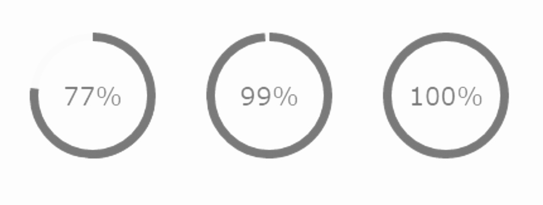
In both HTML scenarios, a div element is styled to achieve the circular form. This process utilizes gradients, specifically a conic-gradient to represent progress and a radial-gradient as an overlay. The conic-gradient demonstrates progress, starting from 0 degrees and extending up to 75% of the circle’s circumference. The radial-gradient, on the other hand, serves as a mask, comprising a white section that aligns with the background and a transparent section revealing the progress bar.
Displaying Percentage Values
Enhancing user comprehension, a percentage value is centrally displayed within the circle. This is achieved by leveraging a pseudo-element with a content property, along with flex properties on the progress bar div for precise centering.
Animation Considerations
A notable caveat is that animating this progress bar is currently only feasible in Chromium-based browsers. This limitation arises from the necessity of the @property rule for animating CSS variable values. To animate, the percentage value is converted into a calc() function for the conic-gradient, and a similar method is applied for animating the percentage value itself.
Concluding Thoughts
While the CSS-only approach for circular progress bars is straightforward, it offers limited customization options, primarily concerning bar width and color. Moreover, due to partial browser support for certain features like animation, this method might not be universally reliable. As an alternative, SVG-based solutions can offer broader customization and compatibility for animated circle progress bars.