The list-style-image property in CSS is a practical tool for web developers and designers aiming to customize the appearance of list item markers. Instead of using default bullet points or numbers, this property enables the use of custom images, thereby allowing for greater flexibility and creativity in web design. This property is particularly useful in enhancing the visual coherence of a website and aligning its design with its overall theme.
Fundamental Concepts of the CSS list-style-image Property
The primary function of the list-style-image property is to substitute the standard markers in list items with custom images. This change can significantly enhance the visual aspect of a website while maintaining its thematic integrity.
Implementation of list-style-image
To implement the list-style-image property, a URL pointing to the image file is specified as shown below:

This CSS rule will apply the specified image as the list marker for all list items within the ul element.
Selecting Suitable Images
When choosing images for list markers, several factors should be considered:
- Size: The image should be appropriately sized to ensure it does not overpower the text;
- Transparency: Transparent backgrounds are preferable as they blend seamlessly with different backgrounds;
- Relevance: The image should be contextually relevant to the content or theme of the website.
Advanced Techniques and Compatibility Issues in CSS
Responsive Design for Varied Devices
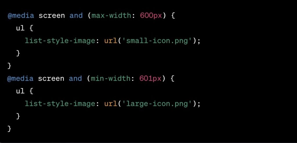
Implementing responsive design is essential for ensuring that custom list-style images display correctly across various devices. This includes adapting to different screen sizes and resolutions. To achieve this, two main approaches can be utilized:
1. CSS Media Queries: These allow you to apply different CSS styles depending on the device’s characteristics. For example, you might choose a larger image for desktops and a smaller one for mobile devices.
Example:

2. Scalable Vector Graphics (SVG): Using SVG for list-style images ensures that they scale smoothly to fit any screen size without loss of quality.
Cross-Browser Compatibility
Not all browsers interpret CSS in the same way. Therefore, it’s critical to test the implementation of list-style-image across a range of browsers, including older versions and less common ones. Use tools like BrowserStack or LambdaTest for comprehensive testing.
Creative Applications of list-style-image
Thematic Integration
Using images that align with the theme of your website can significantly enhance user experience. For example, a website related to gardening might use leaf or flower icons. It’s important to ensure that these images are stylistically consistent with the overall design.
Interactive Elements
Interactive list markers can make a website more engaging. This might include changing the image on hover or integrating animations. However, it’s crucial to ensure that these enhancements do not distract from the content.
Addressing Common Implementation Challenges
Scaling and Alignment
Issues with image scaling and alignment in lists are common. To address these, CSS properties like background-size for scaling and vertical-align for alignment are useful.
Example:

Fallbacks for Legacy Browsers
For browsers that do not support list-style-image, provide fallback styles. This can be done using conditional CSS or JavaScript.
Example:

Impact on Performance and Accessibility
Optimizing Load Times
To reduce the impact on page load times, optimize image sizes. This includes compressing images and considering the use of modern formats like WebP, which offers high-quality visuals at lower file sizes.
Ensuring Accessibility
When customizing list markers, it’s vital to maintain accessibility standards. This includes ensuring sufficient contrast between the image and the background and providing alternative text for screen readers where necessary. Additionally, consider the size of the markers to make sure they are easily distinguishable for users with visual impairments.
Integrating CSS Line Separators with list-style-image
CSS Line Separators for Enhanced List Design
CSS line separators are a useful tool for adding visual distinction between list items, especially when combined with custom list-style images. They can be easily implemented and styled to complement the overall design of the list.
Implementation Steps
1. Add a Line Separator to Each List Item:

2. Style Adjustments: Modify the separator’s color and thickness to match the list-style images and website theme.
3. Exclude the Last Item: For a cleaner look, remove the separator from the last list item:

4. Responsive Design Consideration: Ensure the separators adapt to different screen sizes for consistent appearance.
Complementing list-style-image
The line separators should harmonize with the custom list-style images, either by contrasting for emphasis or blending for a subtle effect.
This integration of CSS line separators with list-style-image not only enhances the visual appeal of lists but also adds to the structural clarity, improving the overall user experience.
Conclusion
The list-style-image property in CSS offers a unique opportunity to enhance the visual appeal of web pages. By understanding its practical implementation, compatibility considerations, and the balance between aesthetics and performance, web developers can effectively utilize this feature to create visually engaging and thematically consistent designs.


