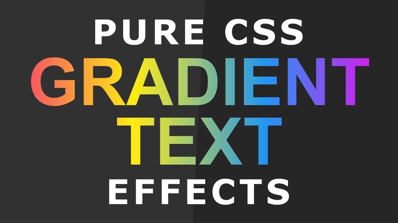
Creating compelling headings that visually impress and engage the reader is a fundamental aspect of successful web design. One way to achieve this is by applying gradient background effects to your text—this can be accomplished using CSS only, with no need for additional scripts or plugins.
The beauty of this process is that it can be applied to any text-contained HTML tag, from heading tags (ranging from h1 to h6), paragraph tags (p), or even division tags (div). In this article, we’ll focus on the utilization of the h2 tag for illustrative purposes.
Consider the following piece of code
<h2> Welcome to the World of CSS! </h2>To fill this text with a gradient, we will use the background-image property along with a gradient, and the background-clip property with the text value. This is necessary to define the boundaries of the background extension. Additionally, in order to allow the gradient to be visible, we will need to set the color property to transparent.
Important tip: If you are working with Chrome-based browsers, it’s crucial to note that they only support the -webkit-background-clip value, not the conventional background-clip.
Let’s look into an example:
h2 {
  background-image: linear-gradient(45deg, #ff7200, #5c00ff);
  background-clip: text;
  -webkit-background-clip: text;
  color: transparent;
}
With this example, we’ve set a linear gradient with a 45-degree angle starting from the color #ff7200 and ending at #5c00ff. Applying this CSS code to an h2 tag will result in a stunning gradient effect appearing within the text.
Add a Hover Effect to CSS Text Gradient
While applying a gradient to your webpage’s text is undoubtedly captivating, you can enhance the visual engagement by incorporating a hover effect. This interactive feature can be realized through manipulating the gradient’s color sequence using the background-image property.
Firstly, let’s reverse the gradient colors within the h2 tag:
h2:hover {
background-image: linear-gradient(45deg,#5c00ff,#ff7200);
}
One essential aspect to note is that while CSS allows for a vast range of effects, it doesn’t directly support gradient transitions. However, this doesn’t mean you can’t create a smooth gradient transition upon hover. With the application of pseudo-classes, achieving a seamless transition is entirely possible.
Start by setting your text tag to ‘position: relative’:
h2 {
  position: relative;
  background-image: linear-gradient(45deg,#ff7200,#5c00ff);
  background-clip: text;
  -webkit-background-clip: text;
  color: transparent;
}
Now, create a pseudo-element that mirrors the properties of your original text gradient but with reversed colors. For this, position the pseudo-element in absolute terms. The most crucial aspect of this pseudo-element is to ensure its content property aligns with the actual text.
h2::before {
  content: 'Hello World!';
  position: absolute;
  top: 0;
  right: 0;
  bottom: 0;
  left: 0;
  background-clip: text;
  -webkit-background-clip: text;
  color: transparent;
  background-image: linear-gradient(45deg,#5c00ff,#ff7200);
  transition: opacity 0.5s ease-in-out;
  opacity: 0;
}
Finally, to display the hover effect, change the opacity upon hover:
h2:hover::before {
  opacity: 1;
}
Inserting CSS into HTML for Text Gradients
The marriage of CSS and HTML is an essential aspect of crafting captivating web designs. To achieve stunning text gradients, you must seamlessly integrate your CSS code into your HTML document. This harmonious union allows you to control and enhance the visual aesthetics of your text elements, resulting in a website that truly stands out.
Wrapping Up
In conclusion, mastering CSS text gradient and its various applications, such as hover effects, can catapult your web design to new heights. While these might seem like minor aesthetic enhancements, they profoundly impact user experience, breathing life into static text and making your webpage more engaging. Learning to manipulate properties such as background-image, background-clip, and creating pseudo-classes for seamless transitions equips you with a robust toolkit for website design. The journey of creativity in web design is endless, and each new skill acquired paves the way to creating more dynamic, visually appealing, and interactive websites.


