CSS line dividers play a crucial role in structuring and organizing web content. These visual elements are not just aesthetic tools; they help segregate sections, enhance user experience, and maintain a clean and readable layout. In the realm of web development, proficiency in implementing CSS line dividers is a valuable skill, allowing for precise control over page aesthetics and structure.
The Basics of CSS for Line Dividers
Cascading Style Sheets (CSS) is a stylesheet language used to dictate the visual presentation of HTML documents. For line dividers, CSS is instrumental in defining their appearance and behavior. Key concepts in CSS relevant to line dividers include:
- The Box Model: Understanding how margins, borders, padding, and content work together;
- Selectors and Inheritance: Knowing how to target HTML elements and apply styles effectively;
- Responsive Design Principles: Ensuring that line dividers are adaptable to various screen sizes.
CSS Properties for Line Dividers
Line dividers in CSS are primarily defined using the following properties:
- border: Specifies the style, width, and color of the divider;
- width and height: These properties are crucial in defining the size of the divider;
- color: This property sets the color of the line divider;
- margin and padding: Essential for adjusting the space around the divider for better visual spacing and alignment.
Types of Line Dividers in CSS
- Horizontal Line Dividers: Used to create a clear distinction between sections vertically;
- Vertical Line Dividers: Employed to separate sidebars, menus, or content in a horizontal layout.
Creating a Basic Horizontal Line Divider
The <hr> tag in HTML, styled with CSS, is commonly used for horizontal line dividers. Here’s a basic example:

Advanced Styling with CSS3 for Line Dividers
CSS3 introduces features such as gradients, rounded edges, and box shadows, offering enhanced styling capabilities:

Responsive Design for Line Dividers
Implementing responsive design for line dividers in CSS is a critical aspect of modern web development. Responsive line dividers adjust to different screen sizes and orientations, ensuring a consistent user experience across all devices.
Using CSS Media Queries for Line Dividers
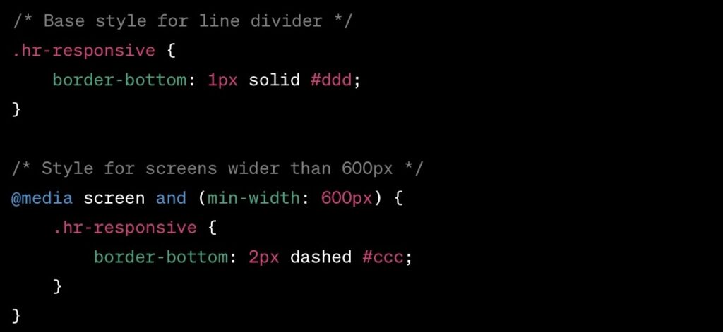
Media queries are used to apply CSS styles based on a device’s characteristics, such as its width, height, or resolution. Here’s an example demonstrating how to adjust a line divider’s thickness and style based on screen width:

In this example, the line divider changes from a solid to a dashed line and increases in thickness for screens wider than 600px.
Line Dividers as a Design Element
Line dividers, while functional, also play a significant role in web design aesthetics. They can be used to enhance the look and feel of a website, contributing to its overall design language. Here, we explore how to effectively incorporate line dividers as design elements.
Aligning Line Dividers with Site Aesthetics
A key consideration is ensuring that the style of the line divider complements the website’s design. This involves:
- Selecting appropriate colors that match or contrast well with the site’s color scheme;
- Choosing styles (solid, dashed, dotted) that align with the site’s design theme;
- Using advanced CSS properties (like shadows or gradients) to create visually appealing dividers.
Conclusion
The effective use of CSS line dividers requires a balance of technical understanding and design sensibility. By mastering CSS properties and responsive design principles, developers can significantly enhance the visual and functional aspects of web projects, creating more engaging and user-friendly websites.


