The web development landscape is evolving at an unprecedented pace, catering to novices just stepping into this expansive field. This comprehensive guide aims to unravel the realm of CSS frameworks, aiding beginners in selecting the ideal framework for their projects.
Simplifying CSS Development
Simplifying CSS development involves several strategies to make styling more efficient and manageable. Here are some tips:
- Use Preprocessors: Tools like Sass, Less, or Stylus allow you to write CSS with variables, mixins, functions, and nested syntax, making code more organized and easier to maintain;
- Modularize CSS: Break down your CSS into smaller, reusable components. This makes it easier to manage, update, and reuse styles across different parts of your project;
- CSS Grid and Flexbox: Learn and utilize modern layout techniques like CSS Grid and Flexbox. They simplify creating complex layouts and help reduce the need for complex positioning;
- Normalize or Reset Styles: Start with a reset or normalize CSS file to ensure consistent styles across different browsers and then build upon it;
- CSS Frameworks: Leverage CSS frameworks like Bootstrap, Tailwind CSS, or Foundation to expedite development. They provide pre-built components and styles that can be customized as needed;
- Linting and Formatting: Use CSS linters like Stylelint or CSSLint to catch errors, enforce coding conventions, and maintain a consistent coding style;
- Responsive Design: Design mobile-first and utilize media queries to ensure your styles adapt well to different screen sizes. This approach reduces complexity and avoids overrides for different breakpoints;
- Comments and Documentation: Comment your code extensively to explain complex or intricate styles. Maintain documentation to help future developers (or yourself) understand the CSS structure and purpose;
- Automate Tasks: Employ task runners like Gulp or Grunt to automate repetitive tasks such as minification, concatenation, and prefixing;
- Version Control: Use version control systems (e.g., Git) to track changes in your CSS files, making it easier to manage different versions and collaborate with others.
By adopting these practices, you can streamline your CSS development workflow, making it more efficient and manageable while ensuring maintainability and scalability in the long run.
Understanding CSS Frameworks
Delving into the core definition of CSS frameworks, these pre-written stylesheets come equipped with predefined HTML elements, classes, and IDs. The primary goal? Expedite web development and alleviate the laborious task of coding CSS from the ground up.
CSS frameworks are pre-written libraries of CSS code that provide a collection of pre-designed and pre-styled components, grids, and other UI elements. These frameworks aim to simplify and expedite web development by offering a foundation of styles and components that developers can use and customize for their projects. Here are key points to understand about CSS frameworks:
Best CSS Frameworks for Novice Developers
For novice developers, CSS frameworks that are easy to learn, well-documented, and provide a balance between simplicity and customization tend to be the most helpful. When choosing a CSS framework as a novice developer, consider your specific project needs, the design requirements, and the learning curve associated with each framework.
Bootstrap: A Definitive Choice
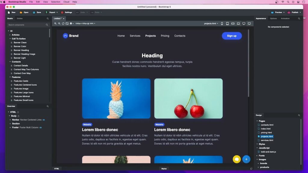
Renowned as the world’s most popular front-end CSS framework, Bootstrap stands tall with its responsive nature and developer-friendly features. Whether utilizing the built-in grid system or the flexbox, Bootstrap continues to dominate the realm of CSS frameworks.
Knowing your perspective will allow me to tailor the review to your needs and highlight the strengths and weaknesses that matter most to you.
For example, if you’re a developer, I might talk about:
- Ease of use: Bootstrap’s learning curve, documentation, and available resources;
- Features: The range of components, utilities, and plugins offered;
- Customization: How flexible Bootstrap is for creating unique designs;
- Performance: Bootstrap’s impact on website loading speed.
On the other hand, if you’re a designer, I might focus on:
- Visual appeal: Bootstrap’s default styles and available themes;
- Typography and layout options: How easy it is to achieve aesthetically pleasing designs;
- Accessibility: Bootstrap’s adherence to accessibility best practices;
- Community and resources: The availability of design inspiration and support.
Bootstrap remains an excellent choice for beginners and experienced developers alike due to its comprehensive set of tools, responsive components, and extensive community support.
Foundation: A Technologically Advanced Framework

While Bootstrap holds a dominant position in the front-end framework world, Foundation comes in as a compelling alternative, particularly for projects seeking a more technologically advanced approach. Here’s a breakdown of Foundation’s strengths:
Cutting-Edge Tech Stack:
- Motion UI: Foundation integrates seamlessly with Motion UI, a JavaScript library for creating smooth and performant animations and microinteractions. This elevates your UI beyond static pages and brings dynamism to your user experience;
- Accessibility-First: Foundation prioritizes accessibility, adhering to WCAG 2.1 guidelines and offering built-in accessibility features like keyboard navigation and screen reader compatibility. This ensures your website is inclusive for everyone;
- Mobile-First: Responsive design is baked into Foundation’s core, ensuring your website looks and functions flawlessly across all devices, from desktops to tablets and smartphones. This aligns perfectly with the mobile-centric nature of web browsing today.
Overall, Foundation presents a compelling option for developers seeking a technologically advanced and flexible front-end framework. Its commitment to accessibility, performance, and cutting-edge technologies makes it a strong contender for modern web projects.
Bulma: Lightweight Elegance
Stepping into the ring of front-end frameworks, Bulma stands out as a lean, mean CSS powerhouse focused on lightweight elegance. Here’s what makes Bulma a contender for your next project:
Minimalism with a Punch:
- No JavaScript: Bulma is pure CSS, making it incredibly lightweight and perfect for static websites or projects where performance is paramount. This simplicity also translates to faster loading times and a reduced learning curve for developers;
- Mobile-First: Responsive design is woven into Bulma’s DNA, ensuring your website looks stunning and functions flawlessly across all screen sizes, from desktops to smartphones. This caters to the ever-growing mobile-first browsing landscape;
- Utility-Based: Bulma abandons bulky components in favor of a comprehensive set of utility classes. These classes handle common design tasks like spacing, typography, and layout, allowing you to build custom interfaces with minimal code.
Effortless Styling and Customization:
- Flexibility: Bulma empowers you to create unique and personalized designs without getting bogged down in complex frameworks. Its utility-based approach gives you granular control over every aspect of your UI;
- SASS-Ready: Bulma integrates seamlessly with SASS, the powerful preprocessor that enhances styling flexibility and maintainability. This lets you leverage variables, mixins, and nesting to keep your code organized and efficient;
- Theming: Bulma offers built-in themes and the ability to create your own, making it easy to tailor the framework’s look and feel to your brand or project aesthetic.
Bulma prioritizes accessibility, adhering to WCAG 2.1 guidelines and offering built-in accessibility features like keyboard navigation and screen reader compatibility. This ensures your website is inclusive for everyone.
Pure.CSS: Embracing Simplicity and Speed
Offering a featherweight footprint of 3.7 KB, Pure.CSS by Yahoo emphasizes speed and simplicity. Its small yet functional modules make it a favored option for those seeking a nimble CSS framework.
Unparalleled Simplicity:
- Tiny Footprint: Pure.CSS weighs in at an astonishing 3.8KB minified and gzipped, making it one of the smallest CSS frameworks available. This leads to faster loading times, improved performance, and a seamless user experience;
- No JavaScript: Pure.CSS is pure CSS, meaning it doesn’t rely on JavaScript for any of its functionality. This eliminates potential compatibility issues, reduces complexity, and further enhances speed;
- Modular Structure: Pure.CSS is composed of independent modules that you can selectively include, ensuring you only load the CSS you need for your project. This prevents unnecessary bloat and keeps your code lean.
Pure.CSS is an excellent choice for developers who want complete control over their designs and prefer building UI elements from scratch using utility classes rather than relying on pre-built components.
Tailwind CSS: Tailored for Customization
In the realm of CSS frameworks, Tailwind CSS stands out with a unique approach that prioritizes granular control, customization, and efficiency. Here’s why Tailwind has gained popularity and might be the perfect fit for your next project:
Utility-First Philosophy:
- No Predefined Components: Tailwind doesn’t offer pre-built components like buttons or forms. Instead, it provides a vast array of utility classes that handle every aspect of styling, from spacing and typography to colors and shadows;
- Build As You Go: This approach empowers you to create custom interfaces from scratch, crafting unique designs without being constrained by pre-defined styles;
- Complete Design Freedom: You have full control over every detail of your UI, ensuring a truly bespoke look and feel that aligns perfectly with your brand or project vision.
Unparalleled Customization:
- Configuration at Its Core: Tailwind is designed to be customized from the ground up. You can create your own color palettes, spacing scales, typography styles, and even custom utility classes to match your project’s specific needs;
- Minimal Unused CSS: This level of customization leads to highly optimized code, reducing bloat and improving performance. Your final CSS output contains only the styles you’ve actually used, resulting in smaller file sizes and faster loading times.
Developer-Centric Workflow:
- Directly in HTML: Tailwind’s utility classes are applied directly within your HTML markup, eliminating the need for separate CSS files or complex class names. This streamlines the development process and keeps your code organized;
- Faster Iterations: This approach often leads to faster development and easier iterations, as you can quickly adjust styles within the HTML without context switching;
- Integration with Preprocessors: Tailwind seamlessly integrates with preprocessors like Sass or Less, allowing you to leverage variables, mixins, and nesting to further enhance your styling workflow.
Tailwind’s ability to create unique and visually appealing designs makes it a popular choice for personal websites and portfolios.
UIkit: A Comprehensive Solution

UIkit stands out as a versatile and well-rounded front-end framework that offers a comprehensive set of tools for building modern web interfaces. Here’s a look at its key features and strengths:
Unifying Components and Utilities:
- Extensive Component Library: UIkit provides a wide range of pre-built components, including navigation, forms, modals, cards, dropdowns, accordions, and more. These components are designed to be both visually appealing and functionally sound, saving you time and effort;
- Powerful Utility Classes: In addition to components, UIkit offers a robust set of utility classes for common styling tasks like spacing, typography, flexbox layouts, and responsiveness. This combination of components and utilities provides both structure and flexibility in your designs.
Responsive Design at Its Core:
- Mobile-First Philosophy: UIkit embraces a mobile-first approach, ensuring that your websites look and function flawlessly across all screen sizes, from smartphones to desktops;
- Responsive Grid System: The framework’s flexible grid system makes it easy to create adaptive layouts that adjust seamlessly to different devices, providing an optimal user experience.
UIkit has a vibrant community of developers and designers who offer support and contribute to its ongoing development. This means you can find help and resources when needed.
W3.CSS: Beginner-Friendly Simplicity

In the world of CSS frameworks, W3.CSS stands out for its focus on simplicity, ease of use, and accessibility. It’s designed to be a straightforward way to style web pages without requiring extensive CSS knowledge, making it a popular choice for beginners and those seeking quick solutions.
Pros:
- Easy to learn and use, even for beginners;
- Quick to implement;
- Single CSS file for simplicity;
- Wide range of predefined classes for common styling tasks;
- Responsive design for mobile devices;
- Focus on accessibility.
Cons:
- Limited customization options;
- Lacks advanced features found in other frameworks;
- Potential for visual similarity across projects that use it.
Ideal Use Cases:
- Basic Websites: W3.CSS is well-suited for creating simple, static websites or landing pages where speed and ease of use are top priorities;
- Prototyping: Its rapid development style makes it ideal for quickly creating prototypes or proof-of-concept designs;
- Learning CSS: Beginners can use W3.CSS as a stepping stone to learn basic CSS concepts and techniques.
Its built-in accessibility features make it a good choice for projects that prioritize inclusive design.
Continuous
Each CSS framework presents unique strengths. Advanced frameworks like Bootstrap, Foundation, UIkit, and Bulma suit long-term projects, while lightweight options such as Pure.CSS, Tailwind, and W3.CSS cater to simplicity and speed.
Sticking to a single framework may limit possibilities. Embracing adaptability and exploring various frameworks is key to discovering the perfect fit for every project. This comprehensive guide aims to demystify the realm of CSS frameworks, aiding beginners in navigating the diverse landscape of web development.
